Jamie Winter
Dr. Leanne Gilbertson
ARTZ 406: Gallery Practices
25 April 2014
Curatorial
Statement: A Space of One’s Own
Women have been
identified as muses and subject matter for artists and writers everywhere for
centuries. As Virginia Woolf cleverly states, “Women have burnt like beacons in
all the works of all the poets from the beginning of time. Indeed if woman had
no existence save in the fiction written by men, one would imagine her a person
of the utmost importance; very various; heroic and mean; splendid and sordid;
beautiful and hideous in the extreme; as great as a man, some would say
greater.” This distinction plays on the fact that women are primarily seen
through the eyes of men, still, though their part in the artistic communities
continues to grow. Woolf goes on the state that in order for a woman to be able
to step off the pedestal they have occupied for years and become successful
writers themselves they must have three things: an education, money, and a room
of one’s own. This creation of
individualized space allows the writer to fully develop her own creative mind
away from the influence of those around her. By doing so, the female writer can
begin to visualize how she fits in to a world that is predominantly male.
The same can be
said for female artists. To find a place within the art community a female
artist must first establish where she fits into her surrounding space. When it
comes to the personalization of internal spaces, artists Breanne Jarrett and
Jamie LaRie Winter explore the ways in which they fit into classically feminine
spaces such as bedrooms and living rooms. Their studies reflect a shift in
roles of females and the contemporary perceptions of their bodies. Though they
both confine themselves to interior spaces, Jarrett and Winter depict an
expanse in mentality in the realms of motherhood and sex, respectively.
Artists Sydne
Sherman and collaborators Jodi Lightner and Amber Stene show their relation to
exterior spaces. Their portrayal of self in the exterior reflect a sense of a
shift in personal growth and development as well as the influence played by
outside sources such as mass media.
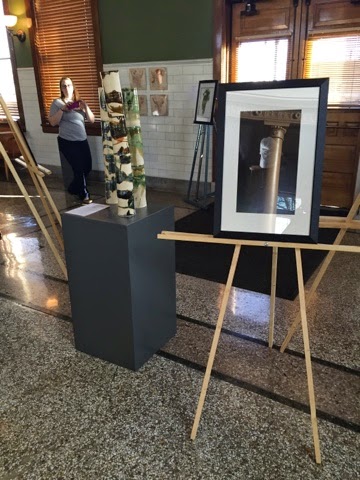
For this exhibit,
I would like the artists to create their own spaces within the gallery that
reflect their sense of space within their two dimensional work. For Jarrett and
Winter, temporary walls will be placed in order for them to each create their
own rooms. They would be encouraged to place objects that reflect their series
(possibly domestic items for Jarrett, remnants of artistic process for Winter)
and they symbolize what they believe to be their own space. Sherman would be
placed in the surrounding areas of the gallery and could use the space as
desired (possibly creating platforms and ledges). Lastly, Lightner and Stene
would be placed in the outer cases and would also be encouraged to create the
space as their own however they see fit.
Inventory
(All from Artists’ Personal Collections
Jamie LaRie Winter
1:30am
Coffee, wine, and India ink on
paper
15” x 22”
2015
Jamie LaRie Winter
2am
Coffee, wine, and India ink on
paper
15” x 22”
2015
Jamie LaRie Winter
4am
Coffee, wine, and India ink on
paper
15” x 22”
2015
Jamie LaRie Winter
12:30am
Coffee, wine, and India ink on
paper
15” x 22”
2015
Jamie LaRie Winter
12am
Coffee, wine, and India ink on
paper
15” x 22”
2015
Jamie LaRie Winter
11:30pm
Coffee, wine, and India ink on
paper
15” x 22”
2015
Breanna Jarrett
Untitled
Archival Pigment Print
24” x 16”
2014
Breanna Jarrett
Untitled
Archival Pigment Print
24” x 16”
2014
Breanna Jarrett
Untitled
Archival Pigment Print
24” x 16”
2014
Breanna Jarrett
Untitled
Archival Pigment Print
24” x 16”
2014
Breanna Jarrett
Untitled
Archival Pigment Print
24” x 16”
2014
Breanna Jarrett
Untitled
Archival Pigment Print
24” x 16”
2014
Sydne Sherman
Untitled
Digital C Print
Size
2014
Sydne Sherman
Untitled
Digital C Print
Size
2014
Sydne Sherman
Untitled
Digital C Print
Size
2014
Sydne Sherman
Untitled
Digital C Print
Size
2014
Sydne Sherman
Untitled
Digital C Print
Size
2014
Sydne Sherman
Untitled
Digital C Print
Size
2014
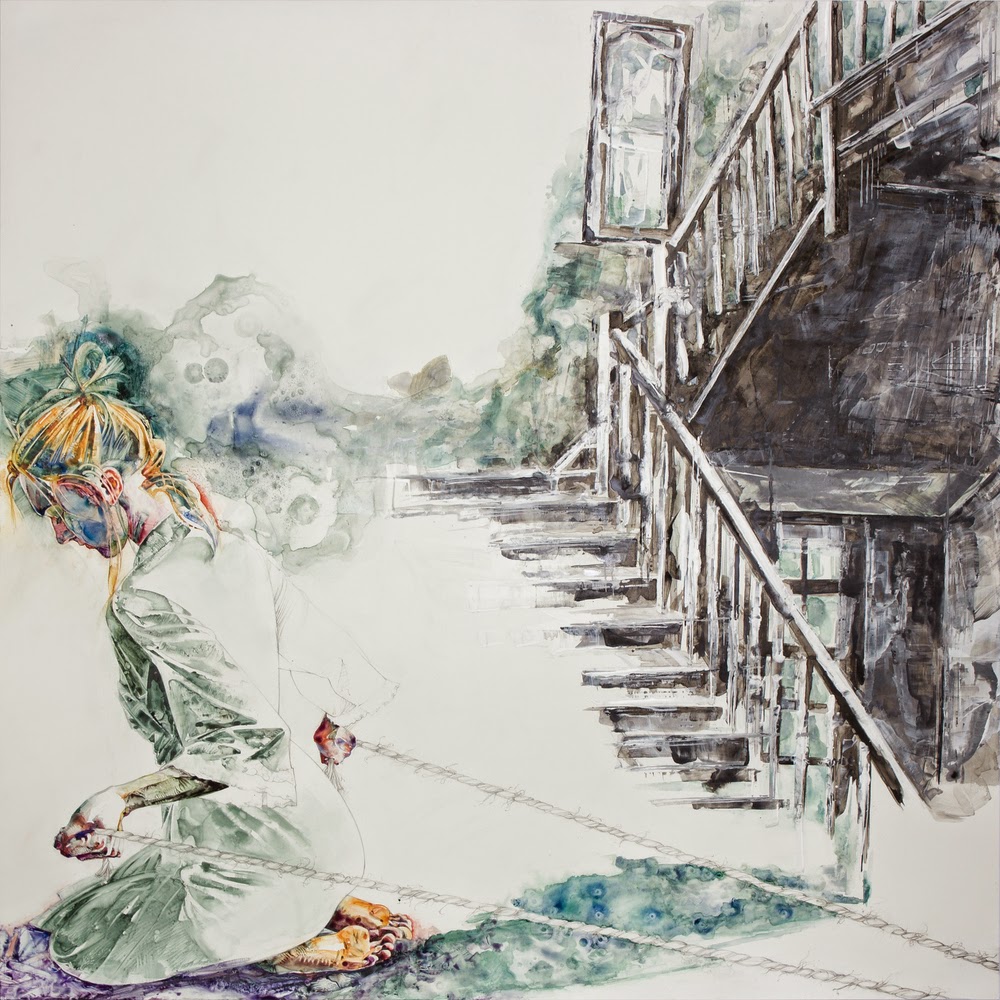
Jodi Lightner and Amber Stene
Unfurl
Acrylic and Watercolor on Yupo
20 “ x 26 “
2014
Jodi Lightner and Amber Stene
Strategem
Acrylic and Watercolor on Yupo
20 “ x 26 “
2014
Jodi Lightner and Amber Stene
Threshold
Acrylic and Watercolor on Yupo
26 “ x 26 “
2014
Breanna Jarrett
Untitled
Graphite on paper
11” x 17”
2014
Breanna Jarrett
Untitled
Graphite on paper
11” x 17”
2014
Breanna Jarrett
Untitled
Graphite on paper
11” x 17”
2014


