For the ASL Art Auction, my group had section A. There were a few spatial issues we had to deal with, such as how to utilize the space when there was a large set of doors interrupting our wall space as well as a large trash can. Unlike the other two sections, we had plenty of space to the point of our section almost seeming bare in comparison. We also had a higher amount of more subtle pieces and photography with only a few pieces with large amounts of color. We used one of these as the anchor piece, leading into our section and separated from the other pieces which far too subtle in comparison.

After leading viewers into our section with a piece with the heaviest visual weight, we allowed for plenty of space before leading into what was one of the more challenging pieces to display.

With this series of four, we struggled with finding a way to display them. The artist requested that they be displayed in a grid format on the wall, but with the limited supplies available we did not have a good way of attaching the pieces. Melissa ended up coming up with the idea of using velcro, attaching one side of the velcro to a clothespin that we had holding the coated wire on the back of each piece. The series took up a fair amount of space and was also one of the stronger entries in our section (it was also had the highest selling price, I believe).
We had multiple photographs and photo manipulations that we separated in oder to avoid a feeling of repetition in the section. We did the same for the multiple black and white images as well. Luckily the amount of space we had made this possible, as well as allowing for plenty of space around each piece to minimize the impact of the pieces around them.

As far as pieces with compositional direction, the piece that we used most for the purpose of directing was Bonny's piece. The direction and size of the piece was a great way to keep the movement through the area and help viewers look past the doors and trashcan behind and turn to look at the pieces behind. Being another piece with vivid color, it was helpful to have the space around to balance the image.
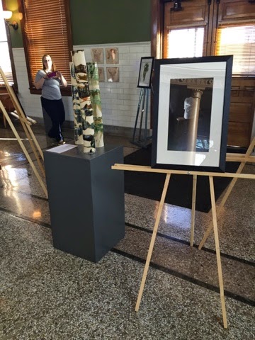
The other issue we ran into, which was easily fixed, was the spacing of one of our sections surrounding Maria's 3D piece. We were afraid viewers would try to walk through the space between the pieces because it was just big enough to pass through. We adjusted the spacing of the section to discourage this.
No comments:
Post a Comment